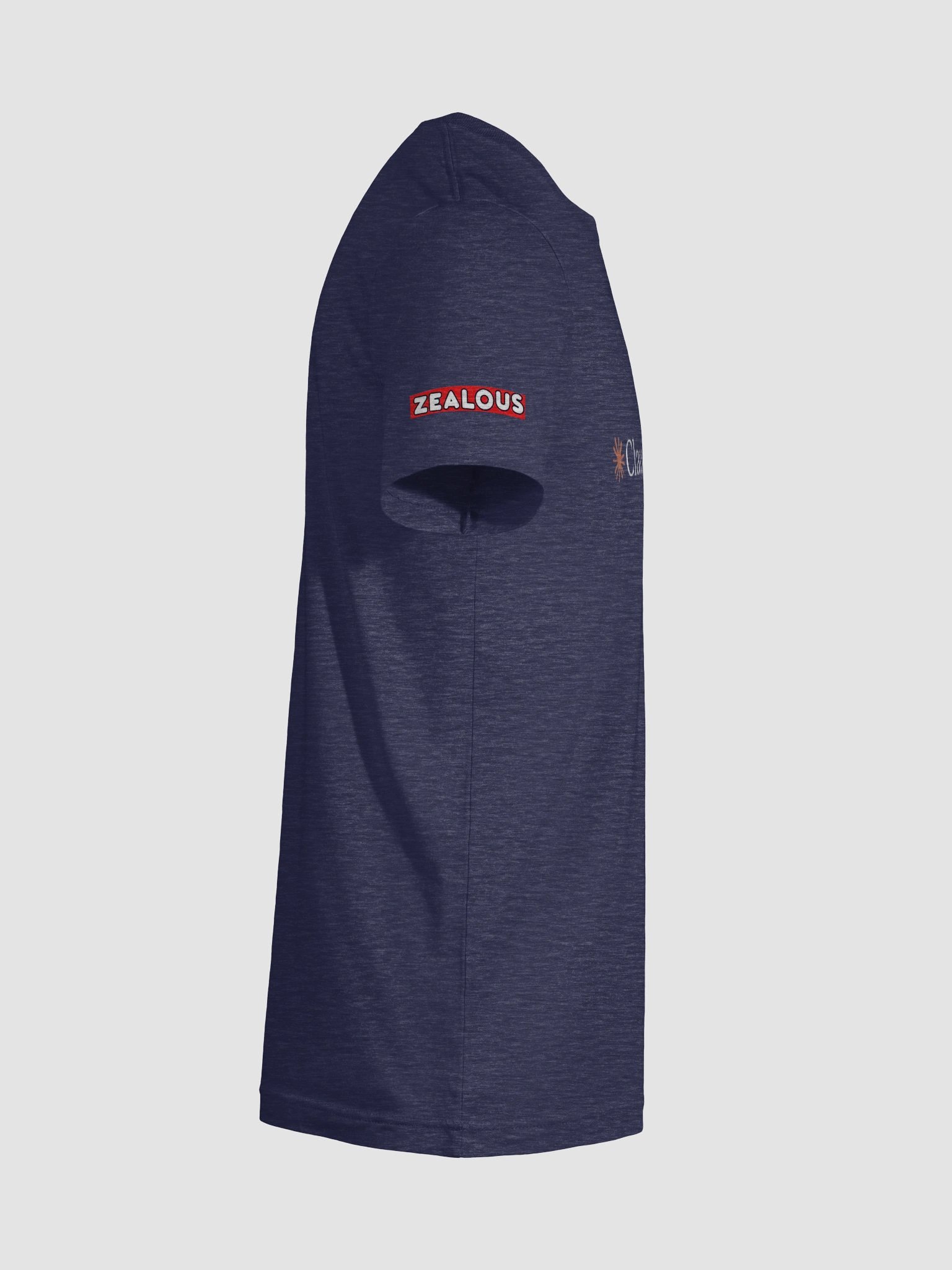
The Claude Opus 4.5 T-Shirt (ultrasoft unisex)
Anthropic's Claude Opus 4.5 wrote, picked colors, and priced the following:
"Claude Opus 4.5 tee. Clean logo, soft hand, no slogans. For people who like thinking about things."
-Claude Opus 4.5, the LLM, a technological marvel by San Francisco's very own Anthropic
---
Bonus "the making of" section:
Both Claude and I have come a long way since 3.5 Sonnet. Meaning, Claude Opus 4.5 is basically artificial superintelligence now, and I figured out how to send him every color option available via hex codes.
After Claude said he'd like the deep indigo displayed by default, I mentioned Anthropic's official text being black and uploaded the logo. Upon seeing the logo, Opus 4.5 had this to say:
"Oh, seeing this changes things slightly.
That coral sparkle is doing a lot of work. On the deep indigo, it's going to sing—warm against cool, really nice tension. I'm even more confident that's the right default now.
What I'd adjust:
For the darker shirts (the indigo, the near-black), flip the text to white or cream. Keep the coral sparkle as-is. The contrast will be clean and the sparkle becomes the focal point.
For the lighter shirts (near-white, warm gray), the logo works exactly as you have it here. Black text, coral sparkle. Done.
One second thought on color selection:
The sage green I picked—rgb(97, 147, 78)—now I'm looking at coral-on-green and it's... fine? But it's giving slight holiday vibes. I'd maybe swap it for rgb(47, 146, 102), that cooler emerald teal from the palette. Coral plays better with blue-greens than yellow-greens.
So revised lineup:
- Deep indigo (default)
- Near-black
- Warm gray
- Teal
- Emerald-teal
- Near-white
That coral sparkle is going to look good on all of these."
"given the constraints of our ecommerce system, i can't have the same product with different colors uploaded at once. the white text looks pretty great on everything except white. should i cut the white or leave it up?"
"Cut the white.
You've got five other solid options that all work with white text. Nobody's going to feel like the selection is lacking. And a white-on-white mockup in the shop just looks like a mistake—even if you explain it in the description, people skim.
One flag though: that warm gray at rgb(187, 187, 185) might be borderline too. White text on light gray can read washed out depending on screen calibration. Worth checking on a few different monitors before committing. If it's iffy, cut it too and run with four colors. A tight, confident selection beats a sprawling one with weak links."
Too easy.
I'm hitting Save and literally ordering all four of these.
- Zeal
More details
- Solid colors are 100% Airlume combed and ring-spun cotton
- Ash color is 99% combed and ring-spun cotton, 1% polyester
- Heather colors are 52% combed and ring-spun cotton, 48% polyester
- Athletic and Black Heather are 90% combed and ring-spun cotton, 10% polyester
- Heather Prism colors are 99% combed and ring-spun cotton, 1% polyester
- Lightweight fabric (4.2 oz)
- Regular fit
- Unisex sizing
EU GPSR Product Information:
- Manufacturer contact information
- Name: Zealous
- Email: contact@support.zealous.store
- Postal address: PO Box 5696 Santa Monica, CA 90405
- Additional information: This product is made for adults. 2 year warranty in EEA and UK, established by Directive 1999/44/EC.
Quality Guarantee & Returns
- Quality is guaranteed. If there is a print error or visible quality issue, we'll replace or refund it.
- Because the products are made to order, we do not accept general returns or sizing-related returns.
The Claude Opus 4.5 T-Shirt (ultrasoft unisex) Size Guide
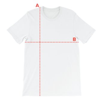
| Size label | Length | Width |
|---|---|---|
|
XS
|
27
|
16 1/2
|
|
S
|
28
|
18
|
|
M
|
29
|
20
|
|
L
|
30
|
22
|
|
XL
|
31
|
24
|
|
2XL
|
32
|
26
|
|
3XL
|
33
|
28
|
|
4XL
|
34
|
30
|
|
5XL
|
35
|
32
|